Scribes of Meridies

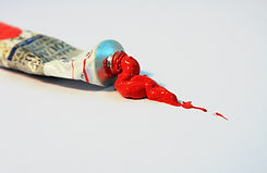
Paint

Getting started with painting can get confusing with all the different options out there. Here are a few tip to help your scribal funds last longer by guiding you which supplies are best to purchase so that you don't waste funds on items you are not going to use. TL:DR You cant go wrong with Winsor & Newton Gouache Paint.
Paint can be intimidating but it is simply pigment and a binder. A binder, like glue, attaches the pigment to the support or "paper." There are many different binders but the pigment all stays the same. The most common paint medium used in Meridies is gouache/watercolor.

Gouache/Watercolor
Gouache (pronounced gah-wash), which is an opaque watercolor, is used most commonly. Gouache and watercolor are water-soluble, meaning they can be re-hydrated and worked with even after drying, and they both have the same binder called Gum Arabic. Though Gum Arabic is a medieval binder, it is still used today. The difference between gouache and watercolor is that gouache has an added white pigment called Blanc Fixe (Barium Sulfate) which creates the lovely opacity.
What to Purchase?
Not all brands of watercolor are the same and within most brands there are there are three different types. Understanding these types can help you make the best choice for you and your budget.
-
Student
-
Artist
-
Professional
Each grade of paint is better than the last and is priced accordingly.
Student grade is a great cheaper option to purchase if you are wanting to give it a try before sinking alot of capital into a hobby. although, Student grade can be more difficult to work with (ie, smooth application, coverage issues, may flake or crack) If you find your having difficulty dealing with the paint consider the quality of paint you are using before disparaging your own abilities.
Brands of Paint
There are so many brands of paint available that it can be daunting choosing the right one. Here is a list of brands with varying quality from least to highest that have been tried and tested by the scribal community in Meridies.
-
Reeves
-
Daler-Rowney
-
Holbein
-
Winsor & Newton
-
Daniel Smith
Common Colors Used in Period
-
Black: Lamp Black, Jet Black, Ivory Black
-
White: Permanent White (underpainting color doesn't bleed through, good for whitework), Zinc White (for mixing)
-
Blues: Ultramarine, Cobalt Blue, Prussian Blue, Indigo, Azurite
-
Greens: Windsor Green, Permanent Green, Sap Green, Chromium Oxide, Terra Verte, Malachite
-
Yellows: Yellow Ochre, Permanent Yellow Deep, Cadmium Yellow pale, Deep Spectrum Yellow, Naples Yellow
-
Orange: Minium, Cadmium Orange
-
Reds: Spectrum Red, Permanent Alizarin Crimson, Cadmium Red, Red Ochre, Madder Lake, Venetian Red
-
Browns: Burnt Umber, Raw Umber, Burnt Sienna, Raw Sienna
-
Metals: Gold, Silver
-
Other: Flesh Tint


More Than You Ever Wanted to Know About Paint
Gouache/Watercolor
Gouache (pronounced gwash) and watercolors are a fair substitute for period pigments due to the fact that they are mixed with water-soluble gum arabic (binder) as was done in period for manuscripts. Although, white pigment or chalk that is added to gouache along with the colored pigment and binder in order to make it less transparent. Other additives such as Ox Gall (keeps the paint wet for longer) and Gum Arabic (binder) can change the appearance and workability of gouache. Experimenting with these additives are encouraged to find what works best for you.
Gouache body color and watercolor are very similar mediums. However both paints have individual characteristics that make them easy to distinguish. Such as, gouache body color is more opaque than watercolor. For example, when a layer of watercolor is applied, the whiteness of the paper and any preliminary drawings underneath show through. But when a full layer of gouache as body color is applied, the paper will not show through. Due to the transparency of watercolor, the light is able to travel through the pigment and reflect off of the white paper, giving it a luminous quality. Although this quality can also be created by using gouache like watercolor, meaning at a higher water to pigment ratio. Another difference is that gouache used as a body color dries very quickly which allows the artist to easily create large solid blocks of color as well as depict minute details. Watercolor, on the other hand, is not as controllable and dries much slower as it uses a high water to pigment ratio.
Many artists use varying consistencies with their Gouache depending on their needs and painting techniques. the most common constancy for opaque Gouache is acheived by adding just a few drops of water at a time to bring the paint to the consistency of a heavy cream. You want it to go on as a solid color in the first coat without there being any clumps or bumps in the paint. It can be difficult to find this careful balance, but keep practicing. Worst case, let watery paint evaporate a little and add extra water if it's too thick! Easy fix!
Gouache can be purchased in either Student or Artist/Professional grades. Artist grade gouache is higher quality and easier to work with than the student grade. Examples of Artist grade gouache are Winsor & Newton and Holbein. The drawback to Artist grade is the cost. For a beginner it is completely acceptable to use the Student grades, such as Artist Loft Reeves, Pebeo, and Savoir Faire.
Artist and student grades are usually stored separately at the art supply store.
*The recommended paint is gouache or opaque water color. Do NOT use acryllic as it tends to chip off the scrolls while they are in the cases and oils can damange the other scrolls and make it difficult to add calligraphy.
Lightfast Rating
All paints have a rating which describes the lightfastness of the individual pigments. Because most of the scrolls that are produced in the SCA will be proudly framed and on display, it is very important that the permanency rating on the container be checked. The most common method of rating is the ASTM scale. A lightfast rating of I means that the color has an excellent lightfastness rating and it will not fade at all upon exposure to light. A lightfastness rating of II is very good, and means that although the color may fade over very long periods of time (many years), the amount of fading will be negligible. A lightfastness rating of III means that the color is unacceptable for fine arts use and the color will fade upon exposure to light.
Oil paints are not recommended. In inexperienced hands they can stain the area around the work, leaving a greasy "halo." Acrylics are also strongly discouraged as they tend to become brittle and crack off of the paper when handled in the manner that our scrolls are handled.
Glair Tempura is a medieval paint using pigment plus glair as the binder. Glair is egg white beaten to a fluff which removes the protein from the clear yellowish fluid that remains. Plus the whipped egg white fluff can then be used to make meringue pie. Glair Tempura is not able to rehydrate after drying but is still workable for quite some time after drying.
Egg Yolk Tempura is also another medieval binder used with pigment to create paint. Egg Yolk Tempura can crack and be brittle on paper unless the right amount of sweetener is added for flexibility. Egg Yolk Tempura also does not rehydrate after drying.
*Poster tempura is not the same as medieval tempura and will crack and flake off the support when dry. Acrylic paint is not a medieval paint and doesn't handle like a medieval paint. It can be manipulated to look like medieval paint but it is not workable when it dries and can flake off while in the cases.
Oil paints are difficult to use on paper because it will cause the paper to deteriorate over time. Paper that is not made specifically for oil painting needs to be primed, with a gesso primer, first, before being painted on with oil paint in order to seal the paper from the damaging effects of oil and solvents and to help the paint bind and cure.*
Dry Pigments
To purchase dry powdered pigments and mix them yourself in a period fashion, there are several sources listed at the end of this handbook under Mail-order supplies.
The techniques involved are a bit more complex than with commercially prepared paints, but worth the effort.
Take your commercially purchased dry pigments and mix them roughly 1:1 with powdered gum arabic then add water to make the right consistency. Experiment with the ratio to get the right amount of adhesion while still maintaining a nice matte finish. On the extremes, too much gum arabic and it will be glossy, too little and it will feel powdery and the pigment may fall off easily.
Dry pigments are not always opaque as are gouache pigments as they dont have the chalk filler that gouache pigments have. Be aware when painting this might be the case to avoid much hair pulling.
Period Pigments
Period pigments are pigments created using completely medieval techniques. Each technique differs for each type of pigment. In period pigments were obtained from dirt, clay, minerals, metals, and precious stones. How to make period pigments is advanced and extensive and therefore not covered in this handbook. If this is an area of interest, please reach out to the Kingdom Laurels or even the Society Laurels
*The following mediums are unacceptable and should not be used to illuminate Kingdom Scrolls: felt tipped pens, “Magic” markers, colored pencils, watercolor pencils, watercolor pens, crayons or gel pens. These items are of suspect permanence and are prone to fading.*
Note: Do not be afraid to collaborate with another artist in creating a scroll. In period, workshops full of scribes worked on different elements of the page, each with their specialty. Working with another artist to highlight each individual’s talent can be very rewarding and produce beautiful pieces. This is also a way to learn new techniques and skills.