Scribes of Meridies

Support
Pergamenata is an italian machine-made paper (by Fedrigoni) with ECF pulp translucent 100% sulphite, neutral pH laminated by natural starches. This us a reasonable cost effective substitute for parchment. It has a close look and similar working properties as parchment. It comes primarily in two thicknesses: 160 g/m² and 230 g/m². The 230 is much heavier and more suited to scrolls. It can be purchased in large sheets (shipped rolled-up) or pre-cut in 11”x14” 8"x11.5", and 5"x7" sheets. This can be purchased from John Neal Books, Pergamina, Paper & Ink Arts, or Amazon. Because of the nature of Pergamenata it is best to use a dry paint or body color gouache as overly wet or watercolor will curl and buckle the paper. Also hand oils will sit on top of the paper and can effect the paint and ink. Make sure to use gloves or wash hands before handling Pergamenata or use a scrap paper between you hand and the Perg as you paint. Mistakes are easy to scrape off as the paint and ink sits on the surface of the paper.
Support basically just means the substrate or Ground the illumination is painted on. And these, Listed below are the "papers" most commonly used in our Kingdom.


Bristol (smooth/hot-pressed) is a smooth support that holds its shape well. It responds to watercolor, bodycolor, and ink very well. Wet mediums get absorbed by the paper slightly which makes scraping off mistakes slightly more difficult and tricky but not impossible. Bristol also comes in vellum surface which is a little bumpier than smooth which makes it slightly difficult to get real crisp, clean calligraphy. This being said, scrolls done in vellum surface will not be turned away.(300 is standard, but 400 and 500 series can also be used--they're just nicer and more expensive; can also be found at Michaels).
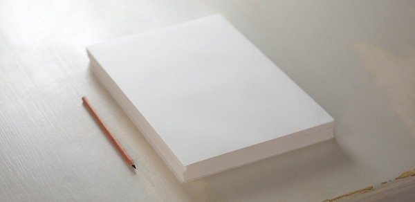
Paper - There are many different types of acid free papers out there. Buy a small amount to try before committing. Some maybe better for paint and some may be better for calligraphy or gold. Try to find one that works for all aspects of a scroll and something that works for you. Many companies produce suitable papers; prominent ones including Arches, Stonehenge, Lans, Rives, Strathmore, Fedrigoni, and Fabrino (which has made paper since the Middle Ages).

Arches Paper
*Please do not use cardstock or watercolor paper as cold pressed paper is too bumpy to successfully render calligraphy. Also watch out for the term vellum and parchment as modern paper makers like to use those terms but they don't mean what they used to and they can become brittle and discolored with age.


Medieval Support:
Parchment or vellum is made from processed animal skin specifically made for books and manuscripts. As this is a lengthy and time consuming process usually done by hand, parchment can be cost prohibitive but also the most period and most desirable to work with. Mistakes can be scraped off easily like butter.
Papyrus was used in the Mediterranean in the early middle ages until 11th c. It was commonly used in rolled scrolls of varying length for documents
Birch Bark was used throughout period written with a blunt stylus to crease the surface. It was rolled or bound in codices
Paper is period and became popular in later period during the renaissance. It was typically made from linen fibers.


Margins
Margins are areas on the edges of a page that has no design or paint on them but are used for mounting to a mat for framing purposes. oftentimes it is not great for paint to sit flush against the glass and framing with a mat is better for the artwork. As a general rule it is recommended to make framing as easy as possible so that the chances of your art work being framed and displayed on a wall of the recipients is higher.
An aesthetically pleasing margin is 1/8th the width of the paper no less than ½ inch up to 2 inches depending on the size of paper. Margins and ruling guides can be erased after the piece is completed or may remain depending on what's most appropriate to the period style of the design.
Scrolls sizes differ according to the exemplar (the example of the original scroll) used. It is suggested to use a size similar to the exemplar plus room for margins and still be framed.
A standard size framing mat used as a template for margins will allow you to quickly and easily determine margin spacing that will allow the recipient to mat the scroll to a market standard frame size without covering portions of the work.
Any scroll sizes created that are outside of this range would have to be specially framed and matted which may be more expensive for the recipient and also could hamper the opportunity of having your scroll displayed on the wall instead of being stuck in a drawer.

Medieval Page Layout

Common framing sizes are:
-
Scroll Size 4×6 - Frame Size with Mat 6×8, 8×10
-
Scroll Size 5×7 - Frame Size with Mat 8×10, 11×14
-
Scroll Size 8×10 - Frame Size with Mat 11×14, 12×14
-
Scroll Size 9x12 - Frame Size with Mat 11×14, 12×14
-
Scroll Size 11x14 - Frame Size with Mat 11×14, 12×14
-
Scroll Size 16×20 - Frame Size with Mat 20×24, 24×28
Layout
Below are two very common layouts for scrolls, though there are MANY others. The first has a decorated initial letter with calligraphy filling in the rest, though additional decorations are frequently added. Another common layout uses a full border with calligraphy on the inside. With all scrolls, leave 1~2" at the bottom for signatures and/or seals. (Click to enlarge)


Text Box

The Text Box is the space on a scroll that should encompass the scroll wording and the signatures and seals. The calligraphy hand should match the style of the design whenever possible. An early period illumination should have an early period hand that would have been used at that time, if not a hand based off of the calligraphy used in the manuscript that the illumination came from.
If the correct hand is not in your repertoire, network with other scribes in the Kingdom and find someone who is a calligrapher that knows the appropriate hand. In period, calligraphy and illumination were frequently done by separate individuals and working with another scribe can be highly rewarding.
Be kind to the herald and include a typed or printed transcript of the wording for the Herald to read in court.

Common Calligraphy Hands
-
Roman Rustic - 1st to 6th century
-
Uncial - 3rd to 6th century
-
Artificial Uncial - 6th to 10th century
-
Roman Half-uncial - 3rd to 9th century
-
Insular Majuscule - 6th to 9th century
-
Insular Minuscule - 6th century onward
-
Luxeuil Minuscule - 7th to 8th century
-
Caroingian Minuscule - 8th to mid 12th century
-
Early Gothic - 11th and 12th century
-
Gothic Textura Quadrata - 13th to 15th century
-
Gothic Textura Prescisus - 13th century onward
-
Gothic Littera Bastarda - 13th century onward
Text Layout is just as important and the layout for illumination. A well thought out layout can significantly improve the overall look of a scroll. and can enhance the medieval aesthetic. Things to consider when laying out the text space.
-
Letter spacing
-
Height of letters
-
Width of letters
-
Line spacing
-
Paper size
-
Text block size
-
Text Box Margins
-
Double columned page
Suggestions: write out the text in pencil first to see if any alteration is needed in the text to fit in the space available.
Another option is to recreate the text box dimensions on a separate sheet of paper and ink out the text using the hand you intend to use in the final product. This will give you a chance to make changes before adding to the final piece as well as practicing the hand. It is common to omit letters and words when writing the text as one begins to focus on the strokes and not the words. Practicing the text out beforehand as suggested can help mitigate that propensity. Also, if the lettering is done before the painting is started, it will not hurt as much to discard and start over in the event that a word is misspelled or left out, or the ink is accidentally smeared.
Once the calligraphy is to your satisfaction, move on to the next step.


Signatures and Seals

Signature spaces are always required for both Sovereign and Consort (except as noted in the Scroll Texts section). On scrolls for armigerous awards (those which carry precedence), a space is also needed for the Beacon Principal Herald, in certain awards. A block of space at least 1 1/2” high should be left at the bottom of the scroll for these signatures. Room must be left near this block for the seals: circles approximately 1 1/2”in diameter for Sovereign, Consort, and, if required, Beacon.
Pencil in lines for the Crowns signature unless the exemplar calls for inked lines. Alternatively, signature spaces may be indicated by writing Rex and Regina (Latin for King and Queen, respectively), or Sovereign and Consort, and, if required, Beacon Principal Herald (or simply, Beacon), leaving a blank space for the appropriate signature. Sovereign and Consort signatures should appear side by side, with the Beacon's signature centered below them. If necessary, the Herald's signature may appear on the stamp level, but to the right of the Royal signatures.
The Complete Anachronist #61 has some examples of period layouts for award charters, showing both vertical and horizontal configurations.
Roman Numeral System
0 not defined
1- I (1)
2- II (1+1)
3- III (1+1+1)
4- IV (5-1)
5- V (5)
6- VI (5+1)
7- VII (5+1+1)
8- VIII (5+1+1+1)
9- IX (10-1)
10- X (10)
11- XI (10+1)
12- XII (10+1+1)
13- XIII (10+1+1+1)
14- XIV (10-1+5)
15- XV (10+5)
16- XVI (10+5+1)
17- XVII (10+5+1+1)
18- XVIII (10+5+1+1+1)
19- XIX (10-1+10)
20- XX (10+10)
21- XXI (10+10+1)
22- XXII (10+10+1+1)
23- XXIII (10+10+1+1+1)
24- XXIV (10+10-1+5)
25- XXV (10+10+5)
26- XXVI (10+10+5+1)
27- XXVII (10+10+5+1+1)
28- XXVIII (10+10+5+1+1+1)
29- XXIX (10+10-1+10)
30- XXX (10+10+10)
31- XXXI (10+10+10+1)
32- XXXII (10+10+10+1+1)
33- XXXIII (10+10+10+1+1+1)
34- XXXIV (10+10+10-1+5)
35- XXXV (10+10+10+5)
36- XXXVI (10+10+10+5+1)
37- XXXVII (10+10+10+5+1+1)
38- XXXVIII (10+10+10+5+1+1+1)
39- XXXIX (10+10+10-1+10)
40- XL (50-10)
41- XLI (50-10+1)
42- XLII (50-10+1+1)
43- XLIII (50-10+1+1+1)
44- XLIV (50-10-1+5)
45- XLV (50-10+5)
46- XLVI (50-10+5+1)
47- XLVII (50-10+5+5+1)
48- XLVIII (50-10+5+1+1+1)
49- XLIX (50-10-1+10)
50- L (50)
51- LI (50+1)
52- LII (50+1+1)
53- LIII (50+1+1+1)
54- LIV (50-1+5)
55- LV (50+5)
56- LVI (50+5+1)
57- LVII (50+5+1+1)
58- LVIII (50+5+1+1+1)
59- LIX (50-1+10)
60- LX (50+10)
61- LXI (50+10+1)
62- LXII (50+10+1+1)
63- LXIII (50+10+1+1+1)
64- LXIV (50+10-1+5)
65- LXV (50+10+5)
66- LXVI (50+10+5+1)
67- LXVII (50+10+5+1+1)
68- LXVIII (50+10+5+1+1+1)
69- LXIX (50+10-1+10)
70- LXX (50+10+10)
71- LXXI (50+10+10+1)
72- LXXII (50+10+10+1+1)
73- LXXIII (50+10+10+1+1+1)
74- LXXIV (50+10+10-1+5)
75- LXXV (50+10+10+5)
76- LXXVI (50+10+10+5+1)
77- LXXVII (50+10+10+5+1+1)
78- LXXVIII (50+10+10+5+1+1+1)
79- LXXIX (50+10+10-1+5)
80- LXXX (50+10+10+10)
81- LXXXI (50+10+10+10+1)
82- LXXXII (50+10+10+10+1+1)
83- LXXXIII (50+10+10+10+1+1+1)
84- LXXXIV (50+10+10+10-1+5)
85- LXXXV (50+10+10+10+5)
86- LXXXVI (50+10+10+10+5+1)
87- LXXXVII (50+10+10+10+5+1+1)
88- LXXXVIII (50+10+10+10+5+1+1+1)
89- LXXXIX (50+10+10+10-1+10)
90- XC (100-10)
91- XCI (100-10+1)
92- XCII (100-10+1+1)
93- XCIII (100-10+1+1+1)
94- XCIV (100-10-1+5)
95- XCV (100-10+5)
96- XCVI (100-10+5+1)
97- XCVII (100-10+5+1+1)
98- XCVIII (100-10+5+1+1+1)
99- XCIX (100-10-1+10)
100- C (100)
Society Year Dates
May 1-April 30
2025-2026
2024-2025
2023-2024
2022-2023
2021-2022
2020-2021
2019-2020
2018-2019
2017-2018
2016 -2017
2015-2016
2014-2015
2013-2014
2012-2013
2011-2012
2010-2011
2009-2010
2008-2009
2007-2008
2006-2007
Corresponds To
LX (60)
LIX (59)
LVIII (58)
LVII (57)
LVI (56)
LV (55)
LIV (54)
LIII (53)
LII (52)
LI (51)
L (50)
XLIX (49)
XLVIII (48)
XLVII (47)
XLVI (46)
XLV (45)
XLIV (44)
XLIII (43)
XLII (42)
XLI (41)
May 1-April 30
2005-2006
2004-2005
2003-2004
2002-2003
2001-2002
2000-2001
1999-2000
1998-1999
1997-1998
1996-1997
1995-1996
1994-1995
1993-1994
1992-1993
1991-1992
1990-1991
1989-1990
1988-1989
1987-1988
1986-1987
Corresponds To
XL (40)
XXXIX (39)
XXXVIII (38)
XXXVII (37)
XXXVI (36)
XXXV (35)
XXXIV (34)
XXXIII (33)
XXXII (32)
XXXI (31)
XXX (30)
XXIX (29)
XXVIII (28)
XXVII (27)
XXVI (26)
XXV (25)
XXIV (24)
XXIII (23)
XXII (22)
XXI (21)
May 1-April 30
1985-1986
1984-1985
1983-1984
1982-1983
1981-1982
1980-1981
1979-1980
1978-1979
1977-1978
1976-1977
1975-1976
1974-1975
1973-1974
1972-1973
1971-1972
1970-1971
1969-1970
1968-1969
1967-1968
1966-1967
Corresponds To
XX (20)
XIX (19)
XVIII (18)
XVII (17)
XVI (16)
XV (15)
XIV (14)
XIII (13)
XII (12)
XI (11)
X (10)
IX (9)
VIII (8)
VII (7)
VI (6)
V (5)
A.S. IV (4)
III (3)
II (2)
I (1)
Scribe's Signature
Always sign your name on the back of the work in pencil or pen if behind a painted area or in the margin area, so as to not show through the paper. A small makers mark in a not-too-obvious place may also be added to the design of the scroll if the artist so chooses.
Indicate all of the participants of a scroll on the back even if there are multiple signatures. For example, a signature for the sketch artist, the liner, gilder, the calligrapher, and the painter or even multiple if there are multiple painters. If one artist does all of these steps, write "Scroll by (name)." Recipients like to know who painted their scroll
Calligraphy Resources
Good resources for calligraphy is Mark Drogin's Medieval Calligraphy Its History and Technique, the Calligraphers Bible by David Harris, and the Art of Calligraphy by David Harris, etc.
A free download copy of The Art of Calligraphy by David Harris is available at Scribd at the link below.
https://www.scribd.com/doc/307399366/the-art-of-calligraphy-by-david-harris-pdf
Also available for free download is David Harris' Calligraphy Bible